
A restaurant entrance is rarely just a door.
It is the first operational test of the night. Before a guest sees the table, reads the menu, or orders a drink, they are already reading the room. Where do I check in? Is there a wait? Am I blocking someone? Should I stand here, move there, go to the bar, ask the host, or pretend I know what I’m doing until someone rescues me?
That initial moment, small as it may be, matters. A beautiful dining room can still start on the wrong note if the arrival feels crowded, confusing, or ignored. The entrance sets the tempo. When it works, guests glide in almost without thinking. When it does not, everyone gets caught in the same small knot by the host stand.
The best restaurant entrance ideas sit at the intersection of design and operations. They are not only about a prettier façade or a more dramatic doorway. They are about improving entryway flow, giving guests better cues, and helping the front-of-house team manage the rush without making the rush look like a rush.
And yes, it can still be beautiful. It should be.
Walk up to the entrance as if you have never been there before.
Not as the owner. Not as the designer. Not as the general manager who knows every weird little shortcut and service path by heart. Arrive like a guest on a Friday night with a reservation, a date, and exactly seven seconds of patience before mild confusion sets in.
Can you tell where to go?
That is the first question every restaurant entrance design has to answer. The host stand should be visible quickly, but it does not need to sit directly in the doorway like a bouncer with menus. The better move is usually a clear visual anchor just inside the entrance, close enough to greet guests naturally and far enough from the door that people can step in without creating a pileup behind them.
Host stand placement is one of those deceptively simple decisions that can make or ruin the front-of-house rhythm. Too close to the door, and the entire entry becomes a bottleneck. Too far inside, and new arrivals drift, pause, scan, and start asking servers where to check in. Somewhere in between is the sweet spot: visible, approachable, and slightly protected from the main circulation path.
The host stand should also have enough room to function. Hosts are not decorative accessories. They are managing reservations, walk-ins, calls, texts, seating charts, guest requests, and the occasional person who insists their party is “basically all here” when nobody is anywhere near the building. Give them space to do the job well.
The doorway should be a transition, not a waiting room.
One of the fastest ways to improve entryway flow is to separate arriving guests from those waiting. That sounds obvious until you watch a busy entrance in real time. People check in and then hover. Friends arrive and gather in a clump. A delivery driver steps in. A couple tries to leave. A server slips through with drinks. Suddenly, the front door has become an obstacle course with hostesses.
This is where queue management becomes part of the design, not just the reservation software. Waiting guests need a place to go that is clear, comfortable, and out of the main path. That might be a slim standing rail near the bar, a small lounge area, a covered exterior zone, or a text-based waitlist that lets guests step away without worrying they will lose their place.
Technology can help, but only when the physical space supports it. The National Restaurant Association reported that more than three in four restaurant operators say technology gives them a competitive edge, especially when it improves convenience while preserving hospitality. In the entrance, that might mean online waitlists, text alerts, reservation pacing, or digital host tools that reduce repeated check-ins at the stand.
The trick is not to make the entrance feel automated. Nobody wants to be processed like luggage. The goal is to remove friction so the human greeting can be warmer, calmer, and less transactional.
A good host stand should quietly announce itself.
Lighting helps. A slight change in flooring can help. A small, well-designed sign can help. Even the angle of the millwork can signal where guests should move. What does not help is a host stand that blends so completely into the bar, service station, or retail display that guests have to guess.
Restaurant entrance ideas often focus on the dramatic pieces: greenery, art, tile, mirrors, or sculptural lighting. Those can be wonderful. But if the guest has to interrupt a bartender to ask where to check in, the design has missed something.
Signage should be tasteful, but it should not be shy to the point of uselessness. A small “Check In Here” marker can be beautiful if it is treated as part of the brand. Same for “Pickup,” “Private Dining,” “Patio,” or “Bar Seating.” Clarity does not have to look cheap. In a luxury restaurant, clarity should look custom.This matters even more because guests arrive with different intentions. Toast’s 2025 reservation data found that 65% of diners surveyed go directly to a restaurant’s website to book a reservation, while 55% use Google when searching for restaurants. By the time they reach the door, they have already formed expectations from the digital experience. The physical arrival should continue that clarity, not introduce a plot twist.
A wait does not have to damage the guest experience. An awkward wait almost always does.
There is a difference between “Your table will be ready in ten minutes. Please enjoy the bar or patio,” and “Please stand in this vague area where you are definitely in someone’s way.” Guests pick up on that difference immediately.
A thoughtful waiting area doesn’t need to be large. It does need to be intentional. A bench along the wall, a few lounge chairs, a drink rail, or an outdoor vestibule can turn dead space into a calmer pause. The point is to let guests settle somewhere without interrupting the door, the host team, or the servers as they move between zones.
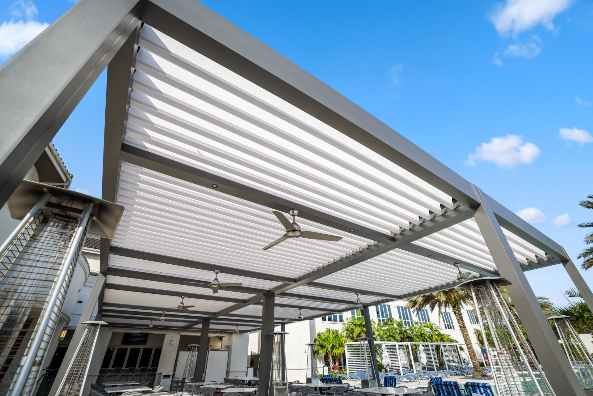
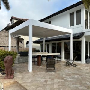
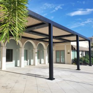
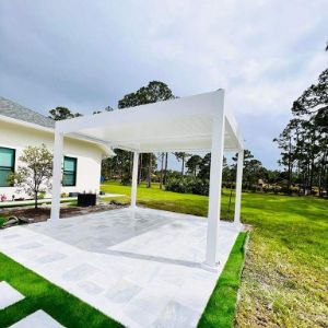
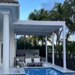
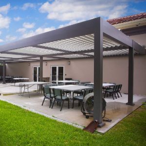
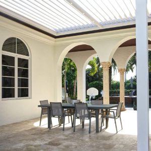
For restaurants with exterior space, the entrance can begin before the front door. A shaded approach, covered waiting area, or structured outdoor arrival zone can soften the transition from parking lot or sidewalk to dining room. This is where pergolas and architectural shade structures can be useful without taking over the story. They define the arrival area, offer relief from harsh sun or passing rain, and make the exterior feel like part of the restaurant experience rather than the place guests wait because there is nowhere else to stand.
SYZYGY Global often approaches outdoor space this way: not as extra square footage but as a functional extension of hospitality. When a covered entry or patio edge is planned well, it helps movement, comfort, and atmosphere work together.
Takeout changed the front door.
A restaurant entrance that once only had to handle reservations and walk-ins may now be managing delivery drivers, curbside orders, mobile pickup, catering handoffs, and guests who only need to grab a bag and leave. If all of that traffic flows through the host stand, dinner service starts to look messier than it actually is.
The fix is often less dramatic than a renovation. Create a dedicated pickup path. Add a clearly marked shelf or counter. Move delivery handoffs away from the seated-dining check-in zone. Make the pickup point visible enough that people do not need to ask, but discreet enough that bags and third-party delivery traffic are not the first thing every dining guest sees.
This is guest experience design in its least glamorous outfit, which is usually where the good stuff happens. A guest with a reservation should not have to stand behind three delivery drivers. A delivery driver should not have to interrupt the host. A takeout guest should be able to leave quickly without walking through a cluster of people waiting for tables.
Everyone’s path should make sense.
Lighting is one of the most elegant ways to guide movement.
A brighter pool of light at the host stand tells guests where to land. Softer lighting near the waiting area tells them where to pause. A subtle glow along an outdoor path pulls people forward. None of it needs to shout. In fact, it works better when it does not.
The entrance should be lit for faces, not just finishes. The host should be able to make eye contact. Guests should be able to read a sign, see a step, notice the edge of a planter, and understand the transition into the dining room. Too dark, and the arrival becomes uncertain. Too bright, and the atmosphere gets flattened before the night begins.
Outdoor lighting deserves the same care. Integrated lighting under a covered entry, pergola, or architectural awning can clarify the route after sunset while adding a lovely, hospitable shimmer. Technical term? Probably not. Accurate? Absolutely.
The best entrance audit happens when the restaurant is busy enough for small issues to surface.
Stand nearby on a peak night and look for the little snags. Where do people stop? Who blocks the door? Can the host greet new arrivals while answering the phone? Are guests waiting in the server path? Do people understand where pickup orders go? Does the bar become a helpful overflow space or a second bottleneck?
Do not judge the entrance at 3 p.m. when it’s empty. Watch it when a six-top arrives early, two walk-ins ask for patio seating, a delivery driver comes in sideways with insulated bags, and someone’s aunt decides the host stand is the perfect place to discuss parking.
That is the real test.
Once you see the patterns, small fixes become obvious. Rotate the host stand. Move a planter. Add a pickup sign. Shift a bench. Re-aim a light. Create an exterior waiting cue. Train the host team to direct guests with the same language every time.
Good flow is often built from small, unglamorous decisions repeated consistently.
A restaurant entrance does not need to do everything. It just needs to do the first things well.
Welcome the guest. Show them where to go. Keep traffic moving. Give waiting guests a place to be. Protect the host team from chaos. Make pickup simple. Carry the design language from the exterior into the dining room with enough grace that nobody notices the mechanics.
That is the quiet genius of strong restaurant entrance design. It makes operations look like hospitality.
The guest does not need to know why the line moved smoothly, why the host stand was easy to find, or why the outdoor waiting area felt comfortable instead of accidental. They simply arrive, understand the room, and begin the evening with less friction.
And in a restaurant, less friction is never a small thing. It is the beginning of a better night.
Follow SYZYGY Global on your favorite platform for more ideas on refined outdoor spaces, restaurant patios, covered entries, and hospitality design that works beautifully in real life. Or, if you’re ready to rethink your entrance, patio, or outdoor guest experience, schedule a complimentary design consultation with our team and start shaping a space that moves better, looks sharper, and welcomes guests with intention.


Name