
Color trends come and go, but certain palettes feel naturally suited to South Florida. Cool blues are one of them. They read crisp in bright sun, pair beautifully with coastal architecture, and create an outdoor living color palette that feels calm, balanced, and intentional.
The key detail is that color is only part of the story. The other half is how the space performs in real life: heat, glare, sudden rain, salt air, and the daily rhythm of how you actually use your backyard. When those details are handled well, the palette feels elevated instead of styled only for a photo.
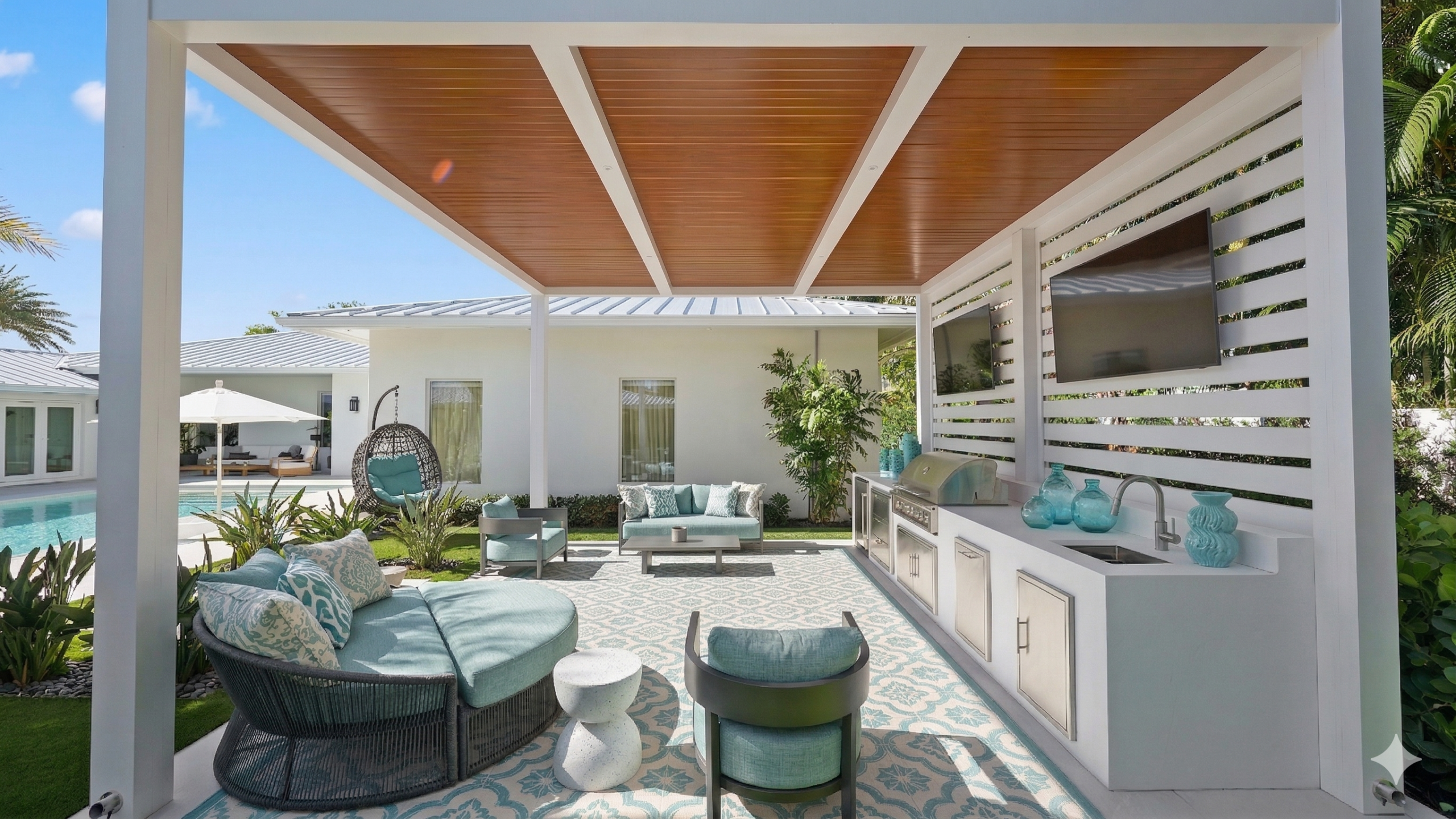
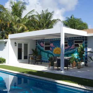
Cool blue tones create visual relief. In a landscape filled with warm stone, lush planting, and reflective water, blue brings balance. It also pairs naturally with the materials that show up in luxury outdoor design, such as light pavers, white stucco, pale woodgrain finishes, and clean-lined metalwork.
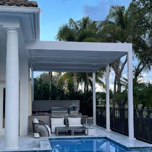
For poolside spaces, blue has an added advantage: it extends the feeling of water. When surrounding textiles and accents echo the pool, the entire yard begins to read as a cohesive poolside color palette rather than separate design moments.
This is one reason cool blue tones appear so often in a coastal color palette. They reflect the surrounding environment while helping outdoor living spaces feel calm, intentional, and visually connected to the landscape.
There is a reason blue appears so often in spaces designed for rest. Research on color and emotion has found that blue tones are commonly associated with low-stimulation positive feelings such as comfort, relaxation, and happiness, which makes them a natural fit for outdoor areas meant for lounging, gathering, and slowing down.
Around a pool, that effect becomes even stronger. Blue connects visually with both the sky and water, so it tends to reinforce what is already present in the setting instead of competing with it. That sense of visual continuity can make an outdoor space feel more settled, open, and cohesive. Research on outdoor blue spaces has also found positive associations between greater exposure to water environments and mental health and well-being, which helps explain why poolside spaces often feel especially restorative.
In an outdoor living color palette, blue also helps soften harder architectural lines. Clean-lined furniture, metal framing, and stone surfaces can feel visually sharp in full sun. Blue accents introduce a cooler, quieter note that balances those materials without making the design feel overly styled.
That is part of what makes blue such a strong choice for South Florida. In a climate defined by brightness, heat, and reflective surfaces, it brings in a sense of ease while still feeling crisp and architectural. For poolside spaces especially, it helps create an atmosphere that feels refreshing, composed, and naturally suited to outdoor living.
If you want a designer look without overthinking it, start with three layers. This simple approach helps create an outdoor living color palette that feels cohesive rather than pieced together.
The goal is repetition, not variety. A few well-placed blue accents will usually look more refined than a mix of competing patterns. When colors repeat across textiles, furniture, and accessories, patio color ideas begin to feel intentional rather than decorative.

Blue tends to work best when it appears in elements that feel integrated into the experience rather than overly decorative. In other words, the goal is to use cool blue exterior accents in ways that support the architecture and the atmosphere of the space.
Consider placing blue in:
If you want to introduce pattern, keep it restrained: tone-on-tone geometrics, small-scale texture, or a simple border. These details tend to feel more refined and timeless than anything too bold or overly coastal.
Cool blues look best in even light. Harsh overhead sun can wash out softer shades and make fabrics appear flat. That is why shade planning matters, not just for comfort, but for the overall look of the space.
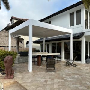
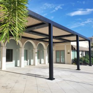
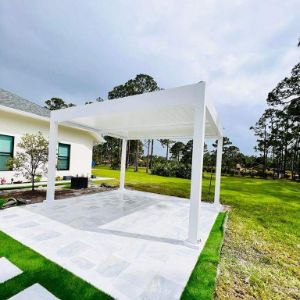
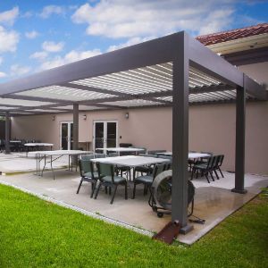
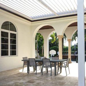
If your seating area is fully exposed, the palette may feel different at 11 a.m. than it does at 5 p.m. A well-designed overhead structure, such as a motorized louvered pergola, creates more consistent light, helping colors read true and making the entire space feel more composed.
In South Florida, this is also where performance matters. Managing glare, handling sudden rain, and keeping the space usable throughout the day all help support an outdoor environment that looks as good as it functions.

A cool palette only works if it continues to look clean over time. When selecting finishes and textiles, prioritize materials that are designed to handle coastal conditions while maintaining a crisp, refined appearance.
This is where engineered outdoor structures earn their place. When the foundational elements are durable and designed for coastal exposure, the styling can stay simple, and the overall palette can still feel polished season after season.
For a pool-focused backyard, keep the palette airy and restrained so the overall effect feels relaxed, polished, and easy to live with. The most successful poolside spaces usually rely on a few quiet, consistent color decisions rather than too many competing accents.
This kind of poolside color palette works especially well when the materials, furnishings, and lighting all support the same calm visual direction. The result feels more like a private resort than a backyard trying too hard to make a statement.
Color trends can be a helpful starting point, but luxury outdoor living is about more than a mood board. The most successful spaces are the ones that feel beautiful and function beautifully through heat, rain, and the everyday rhythm of life in South Florida.
A thoughtful outdoor living color palette should do more than look good in a single season or at one time of day. It should feel connected to the architecture, supportive of how the space is used, and durable enough to maintain its visual clarity over time.
SYZYGY Global designs outdoor environments as site-specific architectural elements, engineered for coastal performance and tailored to the way each client lives. When layout, material selection, light control, and structure are considered together, the result is a space that feels cohesive, elevated, and built for real life.


Name